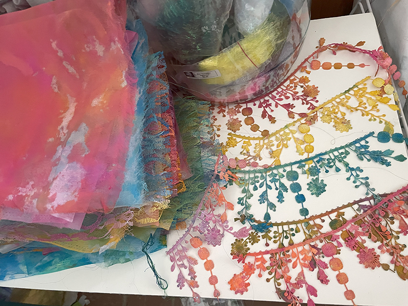
This week I painted a batch of lace and organza. I love using these soft laces because they offer texture and shifting color as another overlay on the surface.
These are not especially elegant laces. The organza is plain poly organza. I often find them in rummage sales. I hit the jackpot at some point when I bought a pile of remanents from a wedding seamstress.
Painting lace is easy. I use acrylic paints from Walmart or Joann’s and mix them with fabric media (available at Amazon) to make the hand of the fabric better. Mix in a little extra water until the paint is the consistency of cream, and paint the lace with sponge brushes. It’s a lovely, messy wildly colored afternoon. You let it dry completely and iron it on a synthetic heat setting.
I’ve heard a lot of people argue for the real thing. Silk organza. Real lace. I love those things too, but it’s not about fiber content. It’s about color, transparency, translucency, and texture. And it’s about whether they work well under the needle and as applique. It helps to know the content so you don’t burn it under the iron.
There’s a short story by Henry James called The Real Thing. It’s about an artist who has a noble couple offer themselves as models. They argue that they are the real thing and that they will add accuracy to his work as his models. But the truth is, he finds the woman who is his ordinary model from a humble and somewhat criminal life could be anything: a gypsy, a fairy, a queen, a courtesan, or a saint. And since she can be anything, she makes his artwork ultimately real.
Painted lace is a test tube baby, made of nylon and polyester. But it creates a wonderful surface overlay. And I really don’t care how real it is.
So, if you know of anyone who is rehoming white poly lace and organza, let me know. I finally used up my stash.
I sat down yesterday and mixed the colors for dyeing. It felt like I was sitting in a circle of old friends. Scarlet, sitting next to Fuschia who had just made friends with a new color Dragonfruit, and was waving across the color wheel to the Lemon/lime.
I’m dyeing fabric today in preparation for surgery. If I’m going to have to go through heart surgery, there better be a really big pony after all the poop. So a pile of fresh fabric waiting for me is sensible. It fills the time while I’m waiting and it leaves me with a lovely pile of fabric to dream about until I can sew again. It’s good preparation I think. And a good way to fill the waiting time.
I started dyeing fabric at thirteen. I found a book in the library that blew me out of the water, with it’s papercut illustrations. The Emperor and the Kite, by Jane Yoland used paper in variegated colors that resembled the hand dye I still do. I wanted to work with the technique and it never occured to me to dye or paint paper. I dyed fabric with Rit.
This all happened in the kitchen sink and my father who was the major cook in the house had opinions about it. My father was almost non-verbal, but he looked like I’d kicked his puppy when he saw the kitchen after I was done. He unblocked the sink, scrubbed it down and said nothing. He always understood the passion around projects. He had his own, and he often helped with mine.
But it set something in me. I don’t really want colors that stand apart from each other .I want them to mingle and to dance within the fabric itself. I’ve been dyeing fabric in some form ever since.
Colors are about relationships. They have relationships with each other that depend on how they are formulated. I am not a dye master. Or someone who can responsibly measure dye and mix it reliably. I dump dye into a cup. I buy a bevy of colors and use them knowing how they relate to each other.
“Knowing the definition of a word is a pinpoint on a map. It tells you where you are. It doesn’t tell you how to get where you want to go. It’s the rawest of beginnings.
In the same way, color theory feels like the the dreariest driest subject in the catalog of art education. We look at the wheel and say the canticle, red and blue make purple, red and yellow make orange…. It feels like a recitation from kindergarten. And sadder still, it’s not always true. We’ve all mixed yellow and blue to get the most grizzly browns. It feels like finding out about Santa Claus or the Easter Bunny. A nice story for children but not really true.
Part of what we’re missing with that is the reality that it’s a theory. It works, simply when it does work and when it doesn’t, we need to explore why. Color theory doesn’t account for imperfect color. Color me surprised. Another thing that is imperfect in a imperfect world.
The most interesting distinction with mixing color for me is the contrast in thermal energy. Each color in its imperfections leans a bit towards the yellow sunny side, or the greenish shady side. If you mix all sun colors or a shade colors, the combinations are clear and bright. If you mix sun and shade, you get earth colors.
So if I place Lavender and Orchid together, as sun colors they blend into each other. If I add Lilac, a shade color, the combination browns out a bit. Still light purple but with a browned quality. If I add a sun color like Clear yellow, it will stay clear. Lemon yellow with its shade qualities will brown it out.
The real question is not where we are on the map but where can we go. What color theory really describes is the relationships between colors. Within the color wheel, the spots within that wheel define the same kinds of relationships between different colors. Those relationships go back to that primary list of monochromatic, complementary, and analogous color themes that seem so very dull. Because they define the tension between colors.
For dyeing, you have to know the name and know the color. They all lean one direction or another. There are no perfect primaries, secondaries or tertiaries. If you know which way they lean, you can predict the effect. But you never know exactly what the dye on fabric will do. And it’s never the same. Each piece of fabric is unique.
The distance between colors, creates the pull across the wheel. The closer they are to each other, the least pull. The least tension. The least excitement.
The farthest distance any color combination has is directly across from each other, as complements. Those are combinations that tug and pull and electrify us. Colors right on top of each other are smooth and slide into each other.
It’s not one combination. It’s a circle of combinations that create the same feeling. We can move the circle endlessly and get the same energetic result.”
Which is why it’s such a good thing I know these colors as my friends. I know who the mix with and who they fight with and what it will look like after they have a party together.
I’m spending two days dancing with color to pour myself into that joy, instead of the apprehension about the surgery. After all, color is really an antidepressant. And I’ll have a lovely pile of new fabric to play with after I’m back and healed.
I’ve just finished Little Blues! I’m delighted with this quilt. It took me a while to get it finished off. In that process, on a whim I added some red silk flowers to the background.
Why red? Why not orange or blue or white? I did try those. But red was it.
I really think it’s worth the while to put up your color decisions on a color wheel. Just how you can see how they relate.
The color wheel gets a bad rap. It’s old fashioned, it’s boring, we all know how colors are made, it’s incomprehensible…. It’s still the best way I know to show the relationships between colors. It shows how colors are created. But most importantly, it shows how they react to each other.
The farther colors are apart from each other, the more tension there is between them. And like every good soap opera, more tension means more excitement.
At which point, you need to ask, where is this quilt going? If it’s in a baby’s bedroom, you might want to keep the tension and excitement to a minimum. But for a gallery? Bring on the excitement!
I was surprised when I put the colors up on the wheel. I didn’t realize how far around the wheel I had gone. But as you can see, the red zings across from the green. I don’t have much in there, but it wakes up a piece that has that sleepy analogous color thing going on without it. Not much. Just a handful of red silk flowers.
I consider using the whole color wheel a visual trick of sorts. It wins awards, and it’s showy, but color needs to be the focus of a piece for that to work well. But this almost full-color wheel is rich, satisfying, and just red enough to get attention.
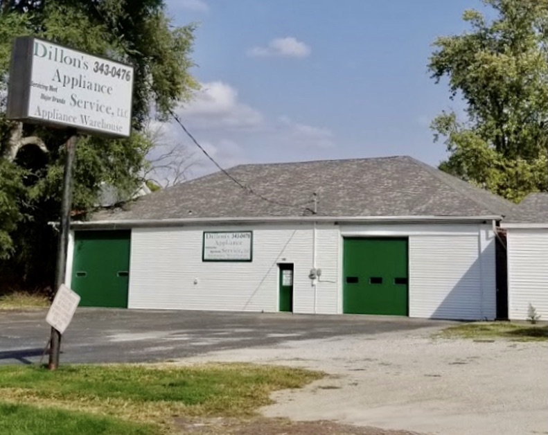
I’ve talked before about using old-fashioned appliances for dyeing. They are hidden gems for dyers! They are made especially for cotton and other plant fibers and work brilliantly in processing cotton.
Now that I’m no longer constantly on the road, I don’t dye as much as I used to. I used to dye around 50 yards of fabric a month. Now I dye around 20 per three months. It’s usually for my own use now, although I make some available in my Etsy shop, and you can always call me up and pick out the fabric you’d like on Zoom or Messenger.
But 50 yards or 20, that’s a lot of fabric to wrangle around. I’ve written about mangles. They are awesome ironing tools. But the other ancient appliance I depend on is a wringer washer.
Am I washing out with it? Ah, no. Cotton has to be soaked in solution and then wrung out. I don’t quite have the space even in a full kitchen dye space to wrangle 20 yards in the sink. Enter, the wringer washer. It will hold ample washing soda solution and fabric, and then wring your fabric out for you.
Unfortunately, like most appliances from the 40s and 50s, they’re a little old and cranky by now. When my beloved Maytag started to smoke, it was old enough to put in for social security as well as vote. We went hunting another wringer washer.
It’s not as easy as it sounds. Most of the ones out there have retired to being lawn ornaments. We found one that looked like it was in good shape except for the rust and the fact that it wasn’t moving when we plugged it in. A parts machine, as Don put it.
It seemed like an easy thing to fix. Maytag made the same wringer washer for around 40 years. These washers were 20 years apart, but almost identical. But we needed to meld them into Frankenwasher! A it of this, a bit of that, put together.
We come to our heros of this adventure. I called around Galesburg, looking for someone who might help us with the frankenwasher project. I got a resounding no. No one had wringer washers. No one knew how to fix a wringer washer. No one would want one, would they?
Until I called Dillons Appliance. I love mom and pop stores. I got Sam who knew is father, Jack, used to work on them.. Jack talked his grandson, Jackson through it. And Jackson, who is a brilliant young mechanic, learned from his grandfather how to fix a wringer washer. IT LIVES!
So the moral of the story is don’t let anyone tell you no. All they are telling you is that they can’t help. Keep going till you find someone who says yes.
And find the really good mom and pop businesses that do say yes, because they are treasures, not only because they are willing to help, but because they have wells of knowledge others may have forgotten, and are there for you.
Do check out Dillons if you need an appliance in Galesburg. Frank and Frankson are my heros.
343 S Chambers St. Galesburg, IL 61401. · (309) 343-0476.
The other hero of all of this is Don, who is willing to drive all over the countryside searching for ancient appliances and his friend Joe who has moved more appliances with Don than I can count. Did I tell you I’m a lucky girl?
The Thread Magic Stitch Vocabulary Book went up yesterday on Kindle and is now available! I’ve been sharing my chapters with you so you can get a taste. This is the classroom book that shows you most of the technique
es I use for my work.
I will be teaching the class, Thread Magic Stitch Vocabulary Book for the Gems of the Praire Guild in Peoria on May 4th with a lecture on May 3rd.
This is my first guild gig in about 10 years. There are a lot of reasons for that, and I don’t know that I’m back to a gig I have to travel for yet. But I am so excited to be back in a classroom, and I’ve found there are so many techniques that have changed or modified over that period of time. And so many more things I can do with those techniques..
So I did this booklet, especially for this class. But it should stand alone as a set of exercises you can use to build your skills and stretch your abilities. There is a full toolbox of free motion techniques you can include in your work with just a little practice.
You can see several chapters up on earlier blog posts.
Skills covered Free motion straight stitch Free motion zigzag Bobbin work Hard edge applique Soft edge applique Working with Angelina Fiber Working with dyed cheesecloth Couching Adding silk flowers and leaves Globbing
I tried to write a book that would cover a lot of information in a small space. I’m hoping you find it useful. You can order the Kindle Stitch Vocabulary Book right now. The print book will be out at the end of the month, and it’s part of your kit if you are taking the class.
I’m so excited to be sharing this material with you and to be out teaching again with the best people in the world. Quilters!
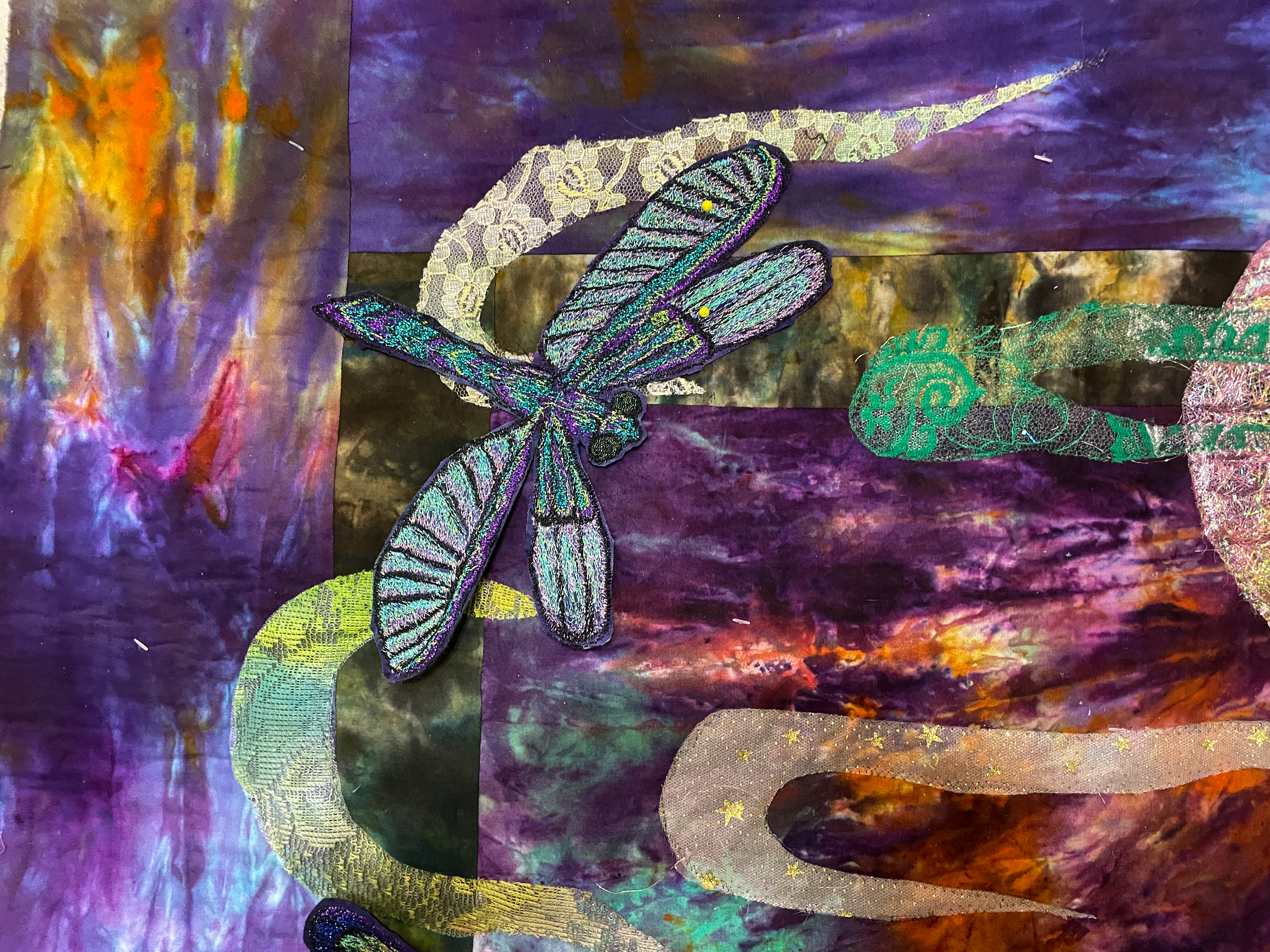
I’ve been rethinking how I usually make my dragonflies for my quilt Great Blue. I picked up some new research books and I was struck how very transparent and translucent their wings were. How could I do that?
Dissolvable stabilizer really is transparent and has that look. But it’s made to dissolve if it gets wet. I can’t promise that won’t ever happen. Humidity itself might dissolve the stabilizer.
I’m pretty sure Saran Wrap would tear. Sure enough not to try it.
I I have used organza or lace. It’s a neat look and I like it. But I wanted a more integrated stitched effect. I wanted them to appear to be see-through.
So I thought about it in terms of thread choices. I love Madeira Supertwist. It’s my go-to metallic thread. There are several color ranges. One range is of solid metallic colors. But one of the color ranges is opalescent and crystal. It’s translucent in itself. So I used it in the transparent part of the wings, and the metallic parts in the exoskeleton of the dragonflies.
It doesn’t look transparent exactly. It looks reflective, like glass or water. Not quite what I had in mind, but I think it does the job.
Here’s the difference. This bug is out of solid metallic thread. It makes a bolder statement, more like an exoskeleton than like see-through wings.
All stitchery is a gigo proposition. Good things in, Good things out. When you use excellent threads and get excellent although sometimes unexpected results. I’m going to try these crystalline threads in other ways where I want a translucent look.
Most of my work centers around threads, so I fuss about them quite a bit. Most threads divide into their components: metallic, rayon, cotton, and polyester. Fs 2/20 is a bit different. It has a black core the metallics are wrapped around and when it’s used in zigzag embroidery looks like little beads.
Madeira Threads Metallic Thread Color Chart FS 2/20
These lizards were stitched as bobbin work, out of FS 2/20. The eyes are sliver.
\
In contrast, these butterflies were all out of Supertwist Madiera metallic, with FS 2/20 bodies. Again, shiny Sliver eyes.
Why does all that matter? Because those three kinds of thread offer a totally separate look that makes the objects embroidered in them automatically different from each other. Your eye sorts for shiny first. That means that first, it sees the shiny eyes, then the supertwist butterflies, and finally the rich beaded looking lizards. Now, how cool is that?
FS 2/20 is not an easy thread to find. To my knowledge, you need to get it from Madeira. But I do think it’s one of the most beautiful threads I know of. They also have Poly Neon and Supertwist and a bevy of embroidery stabilizers.
I have two quilts I’m finishing right now that you’ve been watching me work on. The threads I choose make all the difference in their background effects. Shinier threads will create a shimmer, a wet or wild area. Less shiny threads are more indicative of air or ground. I’m treating them with different threads and patterns to create a specific effect in each case.
For a very wet look, I’ll use Sliver and other flat threads. These really shine across the surface. I prefer them for either starry nights or for water.
The other thread I’m using is Madeira’s bug body thread, FS2/20. This amazing thread has a black core that gives it a very different texture. Zigzagged it does look like bugs. As a stipple it has a sharp look without the intense shine.
I consider both these threads incredibly beautiful and essential. But I use them very differently. Because they create an incredibly different texture. Why is that important? The texture defines the area for our eyes. Shiny thread will create that wet feeling. A sharp undefined metallic does excellent air or dirt, all defined in our thread choices, with no more work to it than that.
Green Heron Hunting is set with water, air, leaf, and ground elements. The air and the ground are very similar. I don’t want a soft look. It’s fall, so I want it to be crisp and textured. So I chose Sliver for my stream. But the ground area with the frogs and the leaf tree tops are stippled zigzag with the FS2/20. There’s a glint of metallic, but it’s different from the high sheen of the water and the eye separates them immediately.
For the air, I chose a driving straight stipple pattern to suggest wind. But I put in a repetitive garnet stitch in it to make it look more driven.
For Fishy Business, the background is all water. So I used Sliver-type threads exclusively. The very shimmery background contrasts highly with the completely poly-embroidered fish. They both shine, but in very different ways.
Your thread choices and stipple patterns define the background. Contrast is the key. If your background and images contrast each other, they will stay visually separate, and help your eye to see the separation.
I don’t follow trends well. If it interests me it interests me. If it doesn’t, it’s background noise. So the snippet thing just went right past me. It’s an interesting technique, but it didn’t work with what I was doing.
So I was working on Green Heron Hunting and I needed to do something different with the leaves. I’ve often used green sheers with stitching to create folliage.
snips arranged on Steam a Seam 2
But I wanted fall leaves. Small fall leaves. I didn’t want them to be detailed. Just bits of color. So for this, the snippet thing made sense. I sat down with a pile of hand dyed scraps, and cut some bits. I cut a cloud shape of Steam a Seam 2. I arranged the bits on to the Steam a Seam 2 backing and pressed them on high heat with a non-stick pressing cloth.
The trick with a pile of snippes is stitching them down without them getting caught in the darning foot or having them go all over. I’ve seen snippets done with tulle over them to control the bits. Personally, I don’t like the look. I can always see the tulle. It looks either too dark or too light and it spoils the effect for me. So i decided to stitch them down with a top layer of dissolvable stabilizer, to keep things from getting tangled.
Dissolvable stabilizers have been around for a while. They are a film made from cornstarch and dissolve in water. They have a lot of commercial uses for computerized embroidery, but they also work well for free-motion embroidery. I don’t know that they stabilize so much as they keep the machine feet from getting tangled in the thread and bits of fabric. Originally they showed up in the 80s as Brama Bags, a dissolvable laundry bag for hospitals, where they were concerned about contagion from people’s laundry. It’s only gotten better since then. There are lots of different brands. The difference is in how thick the film is and how easily it dissolves. I like Aqua Film, which is now called StitcH2O, by OESD. But there are also Solvey, and Badgemaster and new ones come out all the time. What you are looking for is a film that’s steady enough to stitch over without being too thick. Thick ones take forever to dissolve.
That made a tree top I could iron onto the piece itself. But I never trust glue. It sometimes just comes loose. So it needs to be stitched over. And all those little bits of fabric, even glued, are going to go everywhere. So this is where I used my Aqua Film. I pinned over a sheet of the film, and stitched it with a zigzag stitch and a metallic green/brown Metallic thread calledFS2-20.
After all that stitching, I trimmed away any extra stabilizer.
I put it up on my photo wall, got out a spray bottle, and spritzed the stabilizer. It’s not instant. You need to get it really wet. But it dissolves. I put a fan on the piece and it was dry the next day. The color darkened a bit, but I’m still happy with the result.
So these trees work for me. The frogs and heron are so busy, there needed to be similar excitement going on up top.
I’ve also used dissolvable topping film for a technique I call globbing, where you stitch down a glob of thread onto a quilt. Just put the thread where you want it, pin the stabilizer on top, and stitch in circles until it’s significantly attached. They work well for stitching over delicate things like Angelina Fiber, where, again your pressure foot is likely to get caught. You can read about it in Another Fine Mess: Globbing, What’s on Your Floor